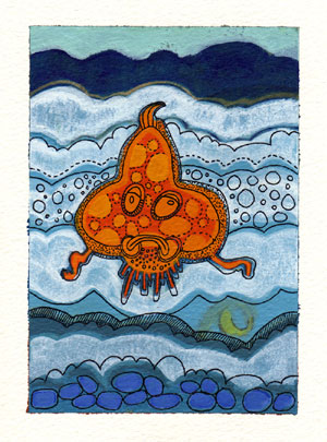
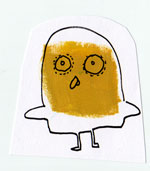
The above piece is 4 3/4″ x 6 1/2 and was created with acrylic, gouache and sakura pen on watercolour paper.
I was excited by this weeks Illustration Friday topic and so decided to create something. I have always loved the sea, I think in part because I grew up in a small seaside town in Wales (the town is called Burry Port and you can see some pics of the harbour here, Burry Port on BBC Wales). One of my fondest childhood memories is of going to the Burry Port beach with my Gran, my brother and our Gran’s blue bucket. We would go to the rock pools and my Gran would turn over the stones for my brother and I to catch the crabs which we would unceremoniously place in the bucket and then swish off home…
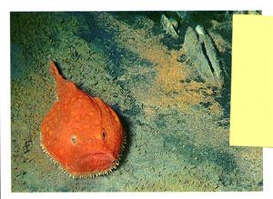
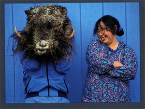
I also thought that having a specific topic might help me push my color choice in a new direction. If left to my own devices I tend to repeat my colour palette. So I spent some time researching in some of my National Geographic mags until I found these two images. From these images I settled on a blue/orange colour scheme.
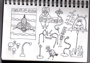
From here I spent some time drawing and came up with a tentative design, as shown below, top left.
If anyone has any suggestions and/or tips on how they push their colour palette, please let me know :)
Have a good night and weekend.
nice image and drawing style. i like the process sketches too.
Hi.
I came for a return visit and what a great blog you have – the drawings and style overall just delicious.
Well done, I love it :)
Looks great in your enlarged image, love the different textures!
just EXCELLENT I see what you did post all your old work then pull out the craziness I’m loving it I think I should try that great work keep it up
Giles, your work is great! I have been drawing fish since 1988 for a series of reference books and your’s brings a sense of wonder.
Great stuff, good to see your sketchbook and the development of the concept. Also liking the animated header of your blog too. Cheers.
Mark.
really great! sometimes repeating colour palettes denotes a signature look, which is kinda cool. Then you will organically start sppinning off from that!
Love it. Very cool that we got to see the steps before the final product
hi!
i love this little thing in yellow, those eyes, it´s great!
happy new year to you too!
This post has been removed by the author.
Oops! The Phinner post above was mine, I accidentally signed in under my friends account. But this is essentially what I said:
What a fun drawing!! Love reading about your process, too. The poor little fishy looks so sad. He’s very expressive.
beautiful works!! Love them all! Great to see your sketchbook, always nice to see the thinking process of an artist.
Great illo! Man that is one grumpy fish!
love
just came back to say thanks for all the support
Mmm, strange fish indeed. Those pens are going well with the paints, and the paper texture. Rock pools are brilliant. Crabs..::-)
Love your work, nice sketchbook page too. Thanks for your comments btw.
kind regards,
Jim McBride
I like orange against the blue tones. The different textures work very well too. That little thing is cute! Great job!
ohh.. i think i missed the drawings.. it shows 404..
but thanks for the hug (comment).. im linking your blog now ^_^
I don’t see your pics at moment, hope it gets sorted out unless it’s a prob at my end. Keep squigglin. Thanks for homepage mention. I intend to link a few sites, will let you know when.
I really enjoy the different shades of blue.
Thanks ever so much to everyone who left a comment. I really do appreciate it!
ValGalArt — thanks too for your response. I hadn’t really thought about the signature aspect of a repeated palette, but I think that’s a good way of looking at it. Thanks!