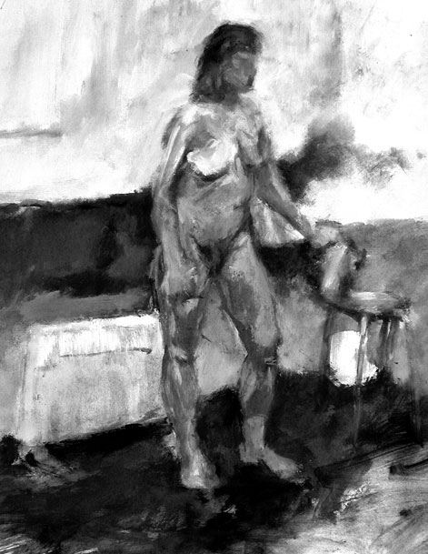
One of my older life drawings that I have always liked. Acrylic painting on paper.
www.gilestimms.com

One of my older life drawings that I have always liked. Acrylic painting on paper.
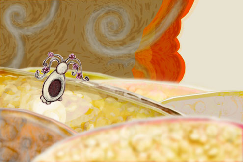
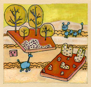
This is one of the main landscape backgrounds for my animated film, ‘Papoose and Bear.’ Created with a combination of acrylic, sculpey and photoshop.
‘Papoose and Bear’ was originally created as the requirement for the class ‘181C – Animation Workshop,’ at UCLA. I am currently in the process of re-coloring the film.
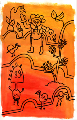
An image from my sketchbook, created with acrylic and pen.
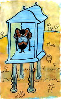
I’m still working on my college applications (lots of writing…), but here’s a sketch book image I did today as a break from writing. Acrylic and pen on paper.
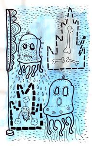
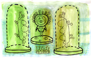
Two sketches from my sketchbook. When I work on a painting I try and use up any leftover colours on my palette by creating coloured grounds in my sketchbook. These are two such coloured grounds with drawings overlaid in pen.
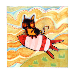
A cat on a rocket. Created with acrylics and pens on Bristol board, 9″ x 9″.
I struggled with this painting and repainted areas several times. I think I struggled because I tried to do some things differently with this piece. I have rarely used black paint so the black cat was something different for me. I hoped too that by using black it would force me away from my reliance on using pens to add detail and line work and that instead I would have to paint my lines.
I’m really trying to improve my brushwork, especially when it comes to laying down fine lines and details. I even bought some new smaller sized brushes, a mix of liners, spotters and rounds of size 1 through 000 (seen below).
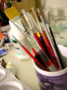
Have a good weekend.
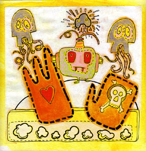
Another painting derived from some characters and imagery in my sketchbook. This was created with acrylic and Sakura pens on a 9″ x 9″ piece of paper. I was excited to try my new tube of silver acrylic paint; I’ve never used silver or gold before, but have both pigments now. So expect to see some more tests with silver and gold. I also bought some acrylic glazing medium which I also used in this piece.
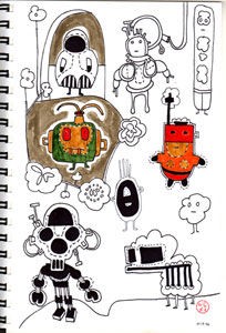
The original sketch of the character in the middle of the painting can be seen below.
It took me a while, but I finally moved CHOBLE.

To commemorate the new home and look of CHOBLE I created a shiny new header image. I darkened the final header image a bit, though the original can be seen above. The header was created with acrylic, gouache and Sakura pens and is 71/2″ x 2″.
I decided to paint the header as I have always been inspired by Ron Russell’s gorgeous blog header that has a wonderful hand-drawn quality to it. To view Ron’s blog header and his excellent artwork go to ronji.blogspot.com.
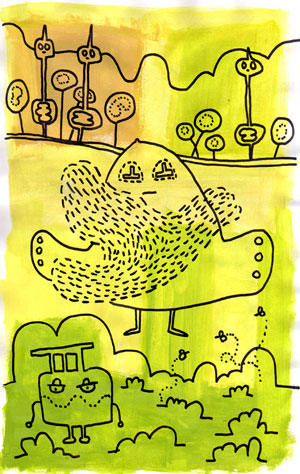
The figure to the left, in the new header, is CHOBLE (I think). He was derived from the sketchbook drawing seen below.
Also, I still haven’t properly finished the move over from blogger so this site will continue to be updated (and I’ll add links!)
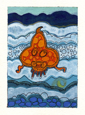
The above piece is 4 3/4″ x 6 1/2 and was created with acrylic, gouache and sakura pen on watercolour paper.
I was excited by this weeks Illustration Friday topic and so decided to create something. I have always loved the sea, I think in part because I grew up in a small seaside town in Wales (the town is called Burry Port and you can see some pics of the harbour here, Burry Port on BBC Wales). One of my fondest childhood memories is of going to the Burry Port beach with my Gran, my brother and our Gran’s blue bucket. We would go to the rock pools and my Gran would turn over the stones for my brother and I to catch the crabs which we would unceremoniously place in the bucket and then swish off home…
I also thought that having a specific topic might help me push my color choice in a new direction. If left to my own devices I tend to repeat my colour palette. So I spent some time researching in some of my National Geographic mags until I found these two images. From these images I settled on a blue/orange colour scheme.
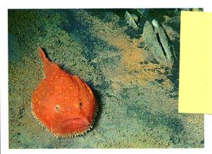
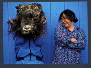
From here I spent some time drawing and came up with a tentative design, as shown below, top left.
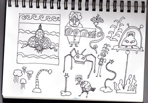
If anyone has any suggestions and/or tips on how they push their colour palette, please let me know :)
Have a good night and weekend.
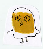
I thought I would change the scale a bit for this one, but it didn’t quite turn out as I had hoped.
Created with acrylic, gouache, coloured pencil and sakura pens
(5 1/2″ x 5″)