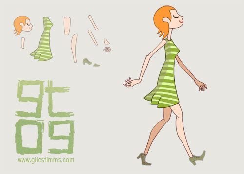
Another vector cut-out created in Flash. This is a Tadahiro Uesugi inspired girl that I created for my Manifestation music video. She has 11 separate girly bits so that she can be animated in a cut-out style.
www.gilestimms.com

Another vector cut-out created in Flash. This is a Tadahiro Uesugi inspired girl that I created for my Manifestation music video. She has 11 separate girly bits so that she can be animated in a cut-out style.
I updated my blog to the latest release of wordpress today (version 2.6.3) and was able to add a really cool plugin for NextGen Gallery. NextGen Gallery allows you to implement and organize galleries and albums on a wordpress site like flickr. I really like NextGen’s implementation and it’s easy to install.
Anyway, with the gallery plugin installed I uploaded the second set of photos from our Gnomon Stop Motion class visit to the Chiodo Bros Studio in Burbank. This set of photos focuses on one of their talented artists, Rick O’Brien, and his amazing painterly work. Rick spent a lot of time with us explaining his texturing and painting methods and concepts – it was great :)
To look at more of Rick’s work, visit his Monument Project and Blog.
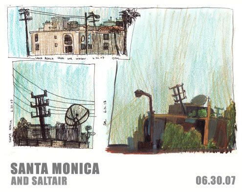
This summer I started a sketchbook devoted to urban sketches of Los Angeles (and surrounding areas). These sketches are the first set in the series and were drawn near Santa Monica and Saltair.
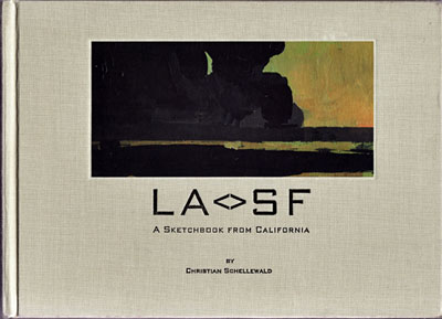
This series was inspired by the book, LA<>SF, A Sketchbook From California, by Christian Schellewald (image below).
It took me a while, but I finally moved CHOBLE.

To commemorate the new home and look of CHOBLE I created a shiny new header image. I darkened the final header image a bit, though the original can be seen above. The header was created with acrylic, gouache and Sakura pens and is 71/2″ x 2″.
I decided to paint the header as I have always been inspired by Ron Russell’s gorgeous blog header that has a wonderful hand-drawn quality to it. To view Ron’s blog header and his excellent artwork go to ronji.blogspot.com.
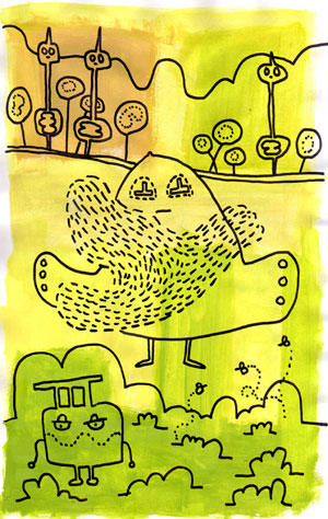
The figure to the left, in the new header, is CHOBLE (I think). He was derived from the sketchbook drawing seen below.
Also, I still haven’t properly finished the move over from blogger so this site will continue to be updated (and I’ll add links!)
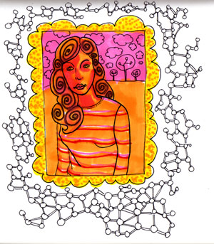
I received a set of Prismacolour brush markers for Christmas and created a set of drawings that were inspired by Smook’s marker drawings (http://reddotblog.blogspot.com/).
I really like the painterly quality of the markers and the blending that happens when you lay colours on top of one another.
These images are all drawn from photos. I’m still trying to learn how to use the markers.
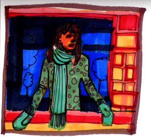
This one turned a bit dark.
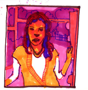
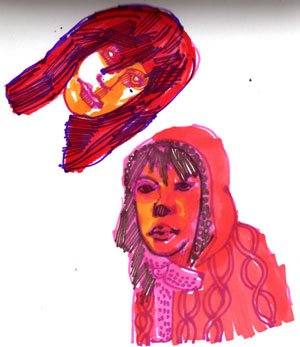
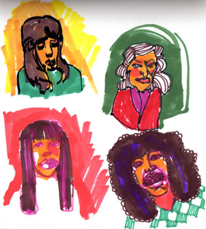
These were my attempt at caricatures.