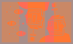
Some orange robots I made as an image for my website. Made with Illustrator.
www.gilestimms.com

Some orange robots I made as an image for my website. Made with Illustrator.

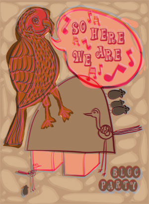
I’ve been itching to make a poster so I decided to make one for a band I like called Bloc Party. The poster references the song ‘So Here We Are’ off the album Silent Alarm. I created all the line work in Freehand and Illustrator and then coloured the design in Photoshop.
To find out more about Bloc Party you can check out their official website at www.blocparty.com.
This is my Christmas Card design for this year. I began the card design with acrylic paint on watercolour paper. I haven’t painted in a while so this project seemed like a good place to start.
The image below is the original acrylic painting.
I wasn’t really happy with my colours or edges in the original painting so I scanned the painting and reworked the design in Illustrator.
Here’s the opening adventure of Marmaduck.
This is my first finished comic style illustration of a character from my sketchbook. I tried to keep things simple , hence no text bubbles and only four panels. I have always loved Double Fine’s comics (go to www.doublefine.com to view) and thought that their four strip panel sets were a good minimum number. Despite keeping things simple it was harder than I thought, but I really had fun creating the Marmuduck panels and it was an excellent new challenge for me. If anyone has any advice on how I can improve my comic skills for the next set, please let me know.
I was also inspired by Pete Fowler’s great little comic strips from his ‘Ken’s Mysterious World’ series. I’ve included a scan below.
I actually created this comic panel for my redesigned web site (which you can view at www.gilestimms.com, though it’s still being updated). I thought that it might make the home page more interesting to have something different every so often, hence the comic. Hopefully I can create a new set every fortnight, especially if I keep things simple with the vector format.
Anyway, this was entirely created in Illustrator.
A lot has happened in the month since I posted last; I resigned at my job, sold my house and decided to apply to a few MFA programs. Anyway, thanks to my family and friends for all the encouragement and support I’ve received recently during this transition.
The image above is derived from a childhood photo of me, my older brother, my mother and our pet bird (called Starsky, after…Starsky and Hutch). My Dad took the photo and I’ve always been really fond of it. The final image is the product of Freehand, Photoshop and Painter.
Two unblinking Diggles, at night.
I wanted to keep this Friday’s image as simple as possible (so that I could get it done in time) and I also wanted to do a bold black and white image. The Diggle is a design from my sketchbook which I redrew in Illustrator with the pen tool and then assembled the piece in Photoshop.
Another Illustration Friday image, these characters originated from my sketchbook.
The original sketchbook character designs were drawn in pen and I am still trying to figure out the best way to create digital line work that I like and that has that pen quality — perhaps it isn’t possible. Anyway, I gave Freehand a go this time and started the image off with Freehand’s variable stroke pen. From there I took the line work into Illustrator and added areas of color with the pen tool and then finally copied the image over to Photoshop where I tweaked the colours and added the swath of yellow. The colours are bolder than I would typically use, but I wanted to try a different palette.
Have a good weekend.

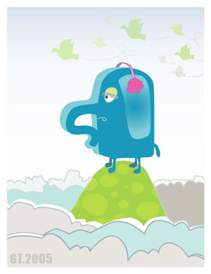
I decided to participate in the ‘Illustration Friday‘ Blog event. This is my submission for the current topic, ‘Remote.’
This is an Illustrator image, derived from my sketchbook. Usually I color the Illustrator line work in Photoshop, but I decided to color this image in Illustrator because I’m trying to improve my Illustrator skills.