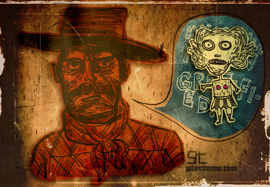
Sketchbook drawings (pen and ink) colored, textured and composited in Photoshop.
www.gilestimms.com

Sketchbook drawings (pen and ink) colored, textured and composited in Photoshop.
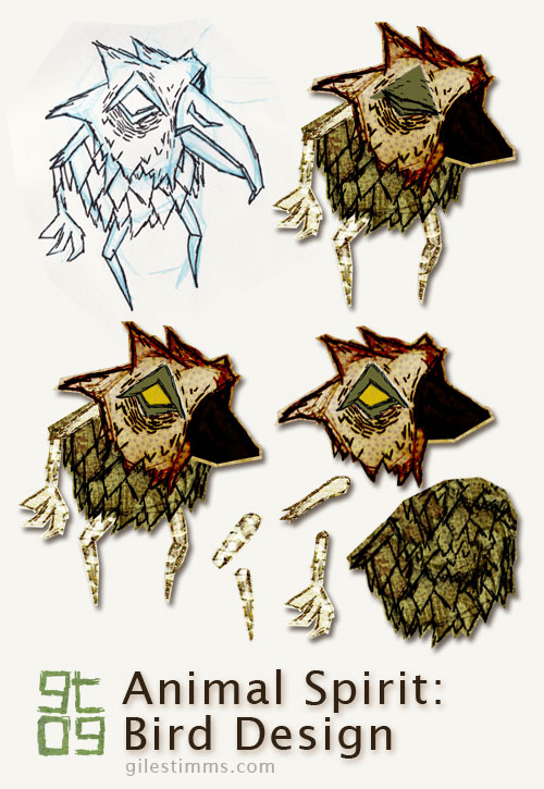
I thought I’d explain the design process for my characters from my animated music video, ‘Dead All Along.’
In the image above you can see the original character design drawing, top left. All the characters for ‘Dead All Along’ started on paper, first as blue pencil drawings, then as pen and ink. I scanned the drawing into photoshop and tweaked the levels so that I the texture of the paper is visible – I really wanted to make the ‘Dead All Along’ world seem as if it was a paper world, almost as though an Edward Gorey inspired book had come to life.
Once in Photoshop, I ‘cut out’ each part of the character so that it can be animated in a cut-out animation style within After Effects. This character didn’t have to animate too much so it only has 9 separate bits, including 2 heads for the blink (eye open, eye closed). You can see the separate body bits in the bottom right of the above image. I cut and separate the body bits using the polygonal lasso tool in Photoshop creating a loose outline of the body part.
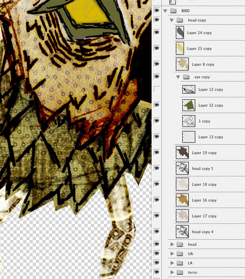
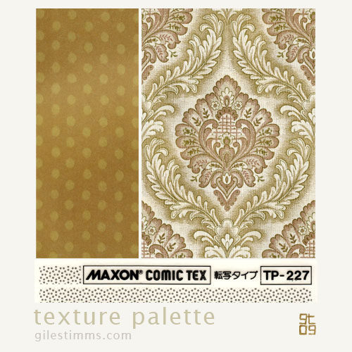
For coloring, I like to color in Photoshop. I use Photoshop because I can easily combine textures with the original character drawing and also because I like to be able to experiment with color ideas. I typically use textures in my coloring process and the characters for ‘Dead All Along’ were also colored with a lot of textures. I keep a texture library of textures on my computer that are scans and photographs of textures, patterns etc. One of my favorite set of textures is a book of origami paper that I scanned in – I used several of these origami papers to color and texture the characters in ‘Dead All Along.’ I’m also fond of the Maxon collection of comic patterns, and I have several of these scanned that I use. Below you can see a screen-shot of my texture library (top), a screen-shot of the textures and layers of the coloring process in Photoshop (middle), and a sample of the texture palette I used for the bird (and yes, that is a wallpaper pattern from the 1970’s :)
